


Arts & Culture
Stages of conflict
Map exhibit captures destructive momentum of World War I
World War I lasted four years, three months, two weeks, and one day. Dozens of nations were involved; more than 65 million soldiers were mobilized; casualties rose to 37 million. The Western Front stretched 600 miles through three countries.
“From the Alps to the Ocean: Maps of the Western Front,” at Pusey Library through Nov. 11, captures the magnitude of the conflict, each map a shard of the shattered mirror reflecting a gruesome war.
Life on the Western Front depended on a labyrinth of trenches quickly and gruelingly dug into battle positions in 1914. Roads, railways, trails, shelters, and ammunition depots sprang up behind the lines, absorbing towns and cities. Small conquests of territory represented big wins — and big losses — in the fight that shaped modern Europe and the Middle East.
Mapping a war
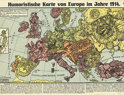
The mapmaker’s editorial spin is evident in this 1914 caricature map, which shows each country with a unique persona. Germany strains against its borders, Serbia attempts to throw a bomb at Osterreich while Turkey holds a lit candle under a Crimean powder keg. Images courtesy of the Harvard Map Collection
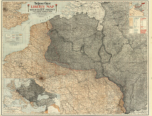
This 1918 rendering shows the enormity of the territory controlled by Central Powers in gray. Published in a magazine for an American audience, the map was advertised as a way to follow the “adventures” of soldiers on the front.
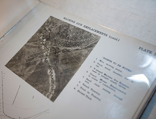
The new field of aerial photography was an invaluable tool to wartime mapmakers, but images could be difficult to read correctly. An original photo shows the extent of damage to the landscape; the resulting map below was adjusted for tilt, scale, and angle. Kris Snibbe/Harvard Staff Photographer
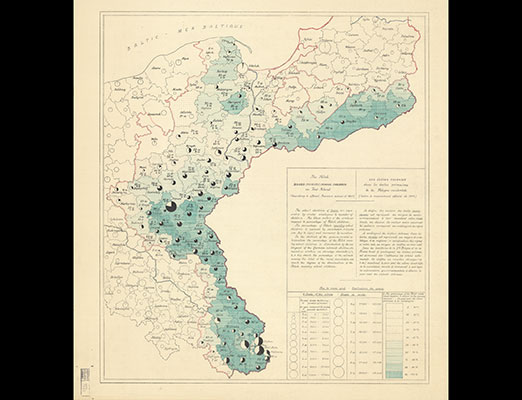
The population of Polish-speaking children in German territory is charted in this data map, one of many factors taken into consideration when redrawing national borders after the war.
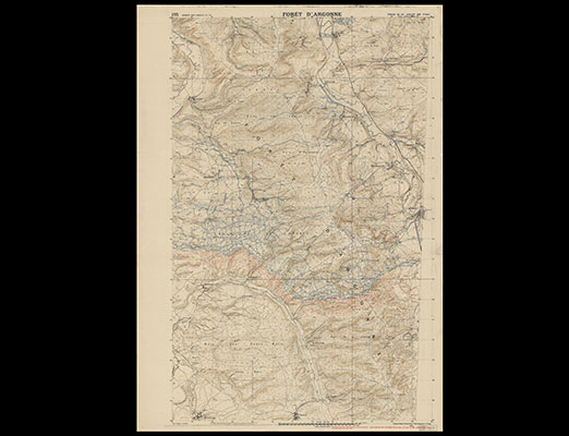
Curator Bonnie Burns used hundreds of plans directeurs, such as this one detailing the Argonne Forest in 1918, in order to pull together the comprehensive map of the Western Front. Red represents Allied-controlled territory, blue German-held lines.
Another example of a large-scale map, which appears in the collection. The maps capture the magnitude of the war. Kris Snibbe/Harvard Staff Photographer
The military, social, economic, and political effects of those crucial shifts are highlighted by the maps on display — handmade, one of a kind, or mass-produced. Some were brought home and donated to Harvard by alumni who had served.
Mapmaking advanced more quickly during WWI than in any previous era. Prewar methods, such as relying on known landmarks, were often useless — landmarks could be destroyed or inaccessible. Trench warfare required soldiers to rely on data. Engineers developed sophisticated ways to gather information, recording flashes and booms from enemy cannons to triangulate location, exploiting the photographic potential of air power to create documents that saved lives.
A guide to reading the aerial images points to the challenges presented by tilt, scale, and bomb-cratered terrain. “It’s hard to tell where anything is when everything looks like the moon,” said Bonnie Burns, curator of the exhibit and librarian for geographic information services.
Plenty of WWI-era maps were not for military use; they were communications tools aimed at illustrating to the home front what was happening in strange and faraway places. Newspapers printed thousands. “They were trying to explain why they were fighting — if anybody knew,” Burns said.
A 1914 German map depicts nations straining against borders; a 1918 U.S. map shows Germany as a looming black cloud poised to descend on Europe. Small details like fonts — gothic for German towns, modern for French — hint at the perspective behind the document.
The fighting stopped but the mapmaking continued, recognizing new boundaries and new nations. Belgium, France, and Denmark expanded; Poland, Latvia, Lithuania, Estonia, Finland, and Yugoslavia formed.
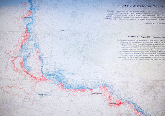
“The maps are amazingly detailed,” said Burns. “As a mapmaker, I wondered how they accomplished that in war conditions with the technology of the time. As a librarian I saw an amazing visual data set I thought researchers would be interested in.” Burns captured the scale and detail of the front in a single map by scanning 300 plans directeurs (detailed maps made by French soldiers), extracting data on trench positions and transposing it on modern road maps.
In her final work, trenches vein across land, a bloody graph of months, years, lives, telling a cartographic story of convulsing cultures and wrenching change.